Packaging
The Peace of Cookies
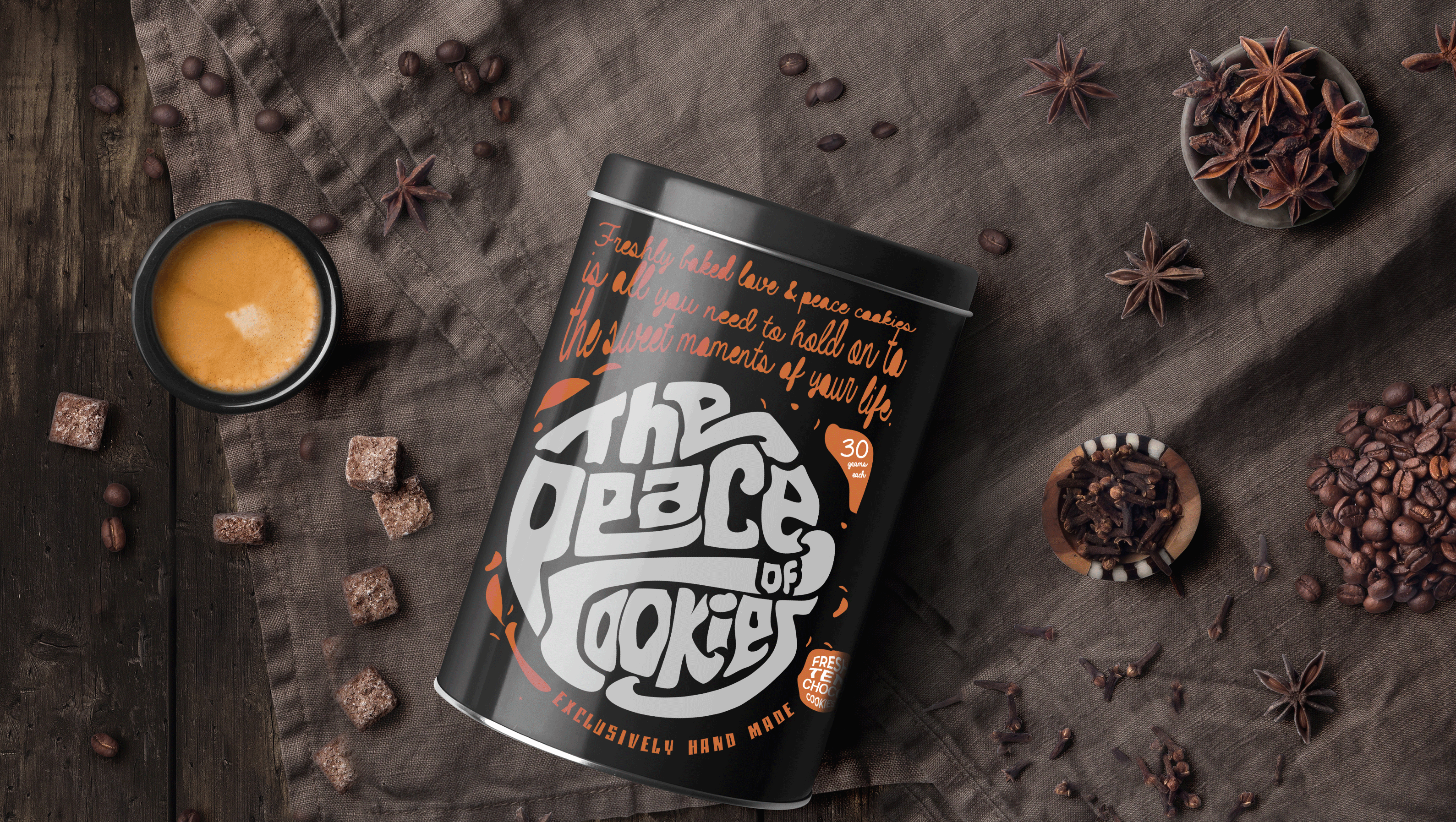
Peace of Cookies is a sub-brand from the World of Shalom. To develop the logo for these sweet treats we chose a fun bold font that justifies the nature of the product. Then we used typography in a unique manner to give the logo a cookie-like look. Free form graphical elements were also used to signify the youthful and bohemian nature of the brand.
Scope: Brand Communication, Packaging Design, Logo Design, Branding

Introduction: Peace of cookie is a sub-brand from the world of shalom. World of shalom is a cafe that brings you flavours from all over the world. They serve scrumptious food which you can enjoy sitting in an aesthetically pleasing environment. For Peace of cookie, we were required to make packaging that appears fun and exciting.
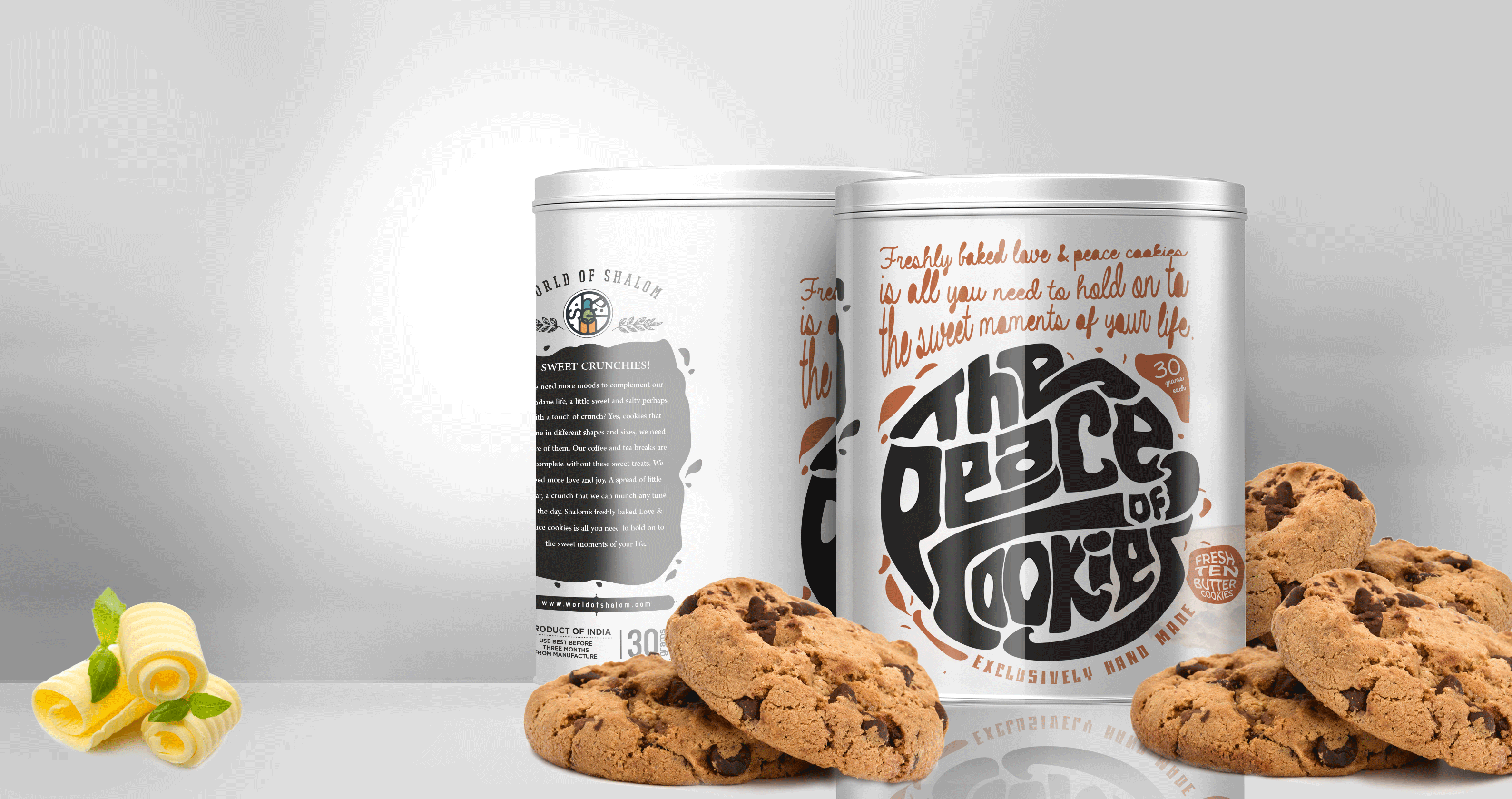

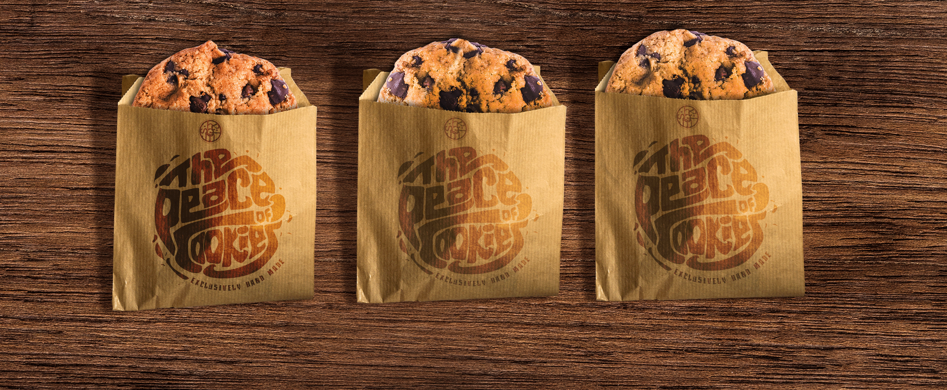
Cookies are sweet, tempting and a tease to the eyes. We used an hand written font to show the casual fun we feel while eating a scrumptious cookie. The moment you look at the packaging you would glance at “The Peace of Cookie” taking the shape of a cookie. It appears to be merry and lively in white colour. The earthy paper packing gives an organic feel, saying that it is fresh and hand-made. Free form graphical elements were also used to signify the youthful and bohemian nature of the brand.