Branding
Altrview
Altrview is a brand that provides unworldly experiences to people through the power of AR and VR. So when tasked to design their brand identity, we looked at beautiful elements that make us wonder and fuel our imagination. After deliberating over loads of them, we finalized three that resonated best with the brand. We choose an exclamation mark since that is the most common way to express wonder. We chose a child looking up in wonder since they see things from a unique perspective and have a vivid imagination. And we chose a thing of beauty, the butterfly. These three came together to form an element that could represent what the brand is all about.
Scope: Brand identity, Communication, Branding, Strategy, Logo Design

Introduction:
Altrview is a brand that comes from “Innovatiview India Pvt. Ltd.” The brand provides end-to-end tech solutions to educational companies and infotainment companies. They have worked on spectacular animation projects and worked with High-tech Interpretation Park, Scientific Galleries and Museums in the country. With the help of AR and VR, they are providing magical experiences to the world. They specialise in providing solutions to theme parks, high-tech interpretation centres and digital galleries. They use innovative technologies like augment reality, android robotics, 3d architectural projection, video walls, spherical immersive projection, and a lot more.

Brand Identity:
The development of brand identity starts with a thought. This brand makes people wonder, makes them feel fascinated and makes them enjoy the beautiful world around them. So, we started thinking and came upon many ideas. For example, what makes people wonder, what is the most used expression for showing fascination or ideas, and what symbol do we use most for it? What fascinates people? Who gets fascinated the most? What is fascinating? Out of so many fascinating things in the world, what are we reminded of?
Our answers and observations came like this:
An exclamation mark expresses fascination. A child shows how little things are the subject of fascination. Nature is wonderful and so is the butterfly that goes from flower to flower.
We had to create something that showed all these ideas in a graphical form and then we started experimenting.
And we came up with various options. The final logo shows all the elements that we talked about.
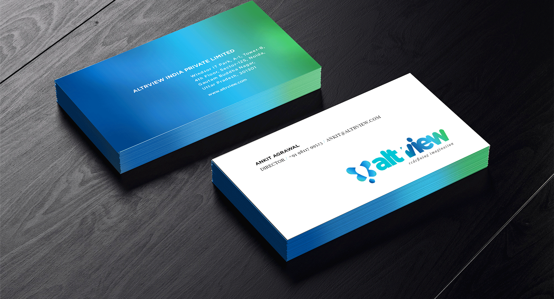
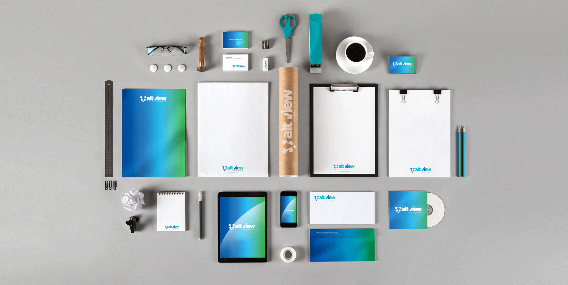
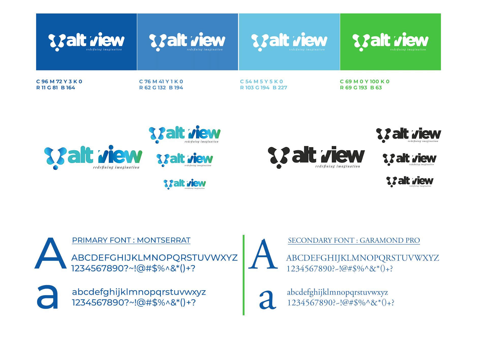
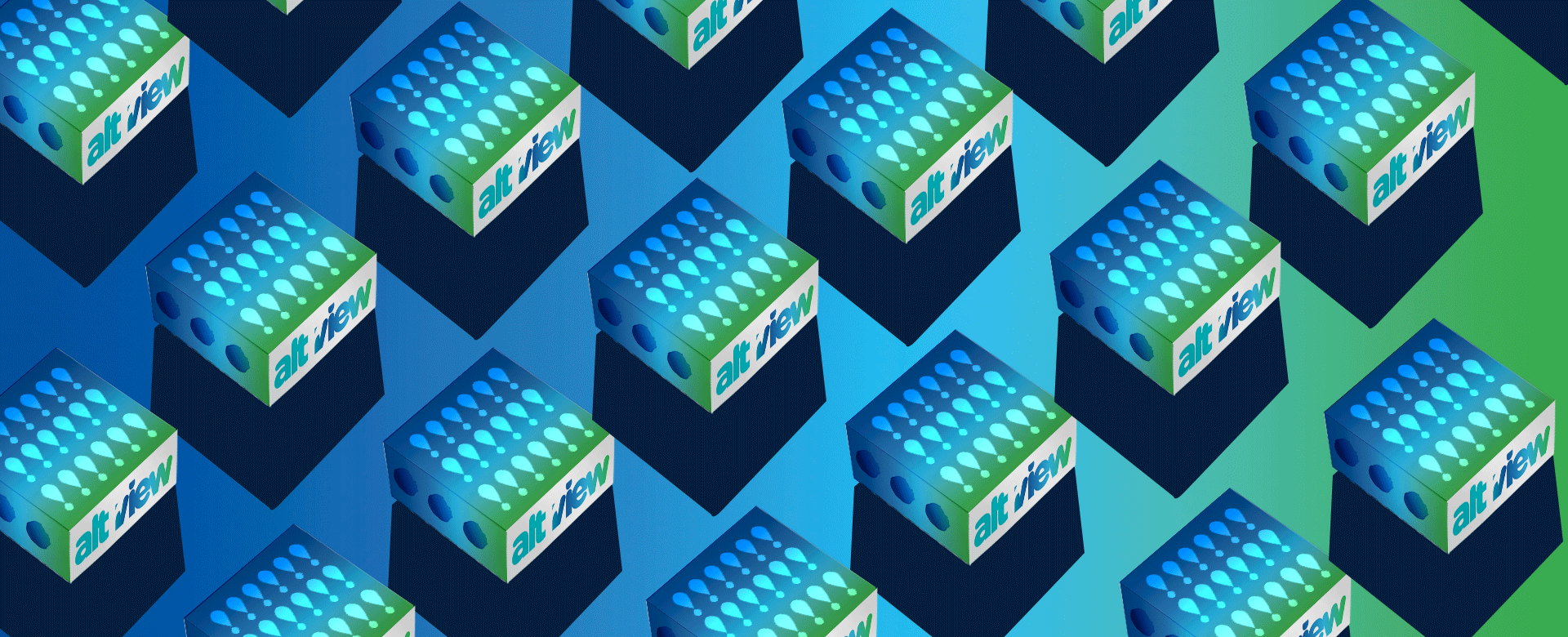
We used Garamond Pro and Montserrat for typography as they stand as timeless fonts, at the same time give an innovative impression. The colours for the brand are blue and green as they represent innovation trust and freshness.
It becomes difficult to show different symbols together as a unit that stands independently, conveying a thought. We overcame all hurdles as we had constant support from “Altrview” team.
This project helped us to enter a world of innovation and design something unique.