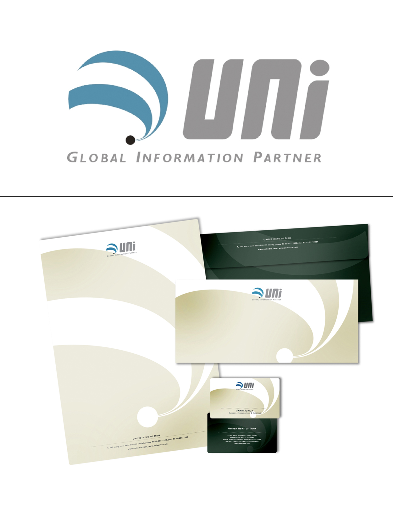
Branding
UNI
Brief: To craft a new corporate identity for UNI, one of India’s largest news agencies.
Idea: A ‘dot’ representsthe epicentre of our business where all the collected information flows in.So we use this element to demonstrate the assimilation of information from around the globe. Followed by a flowing out of information from us. It connotes a seamless, constant process. The pattern of flow is in blue to suggest technology. It also gives the impression of a globe without physically marking it out. The font is clean and lean. It gives digital cues, yet is simple and uncomplicated.Shows the human ‘partner’ side of UNI.