Branding
R V University
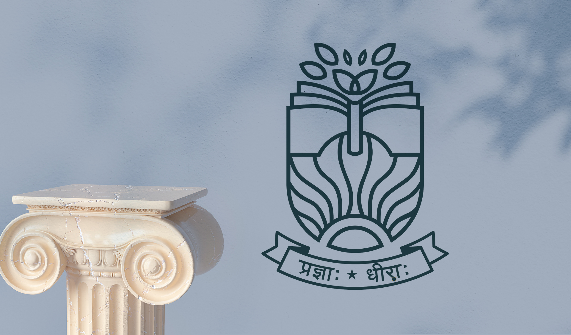
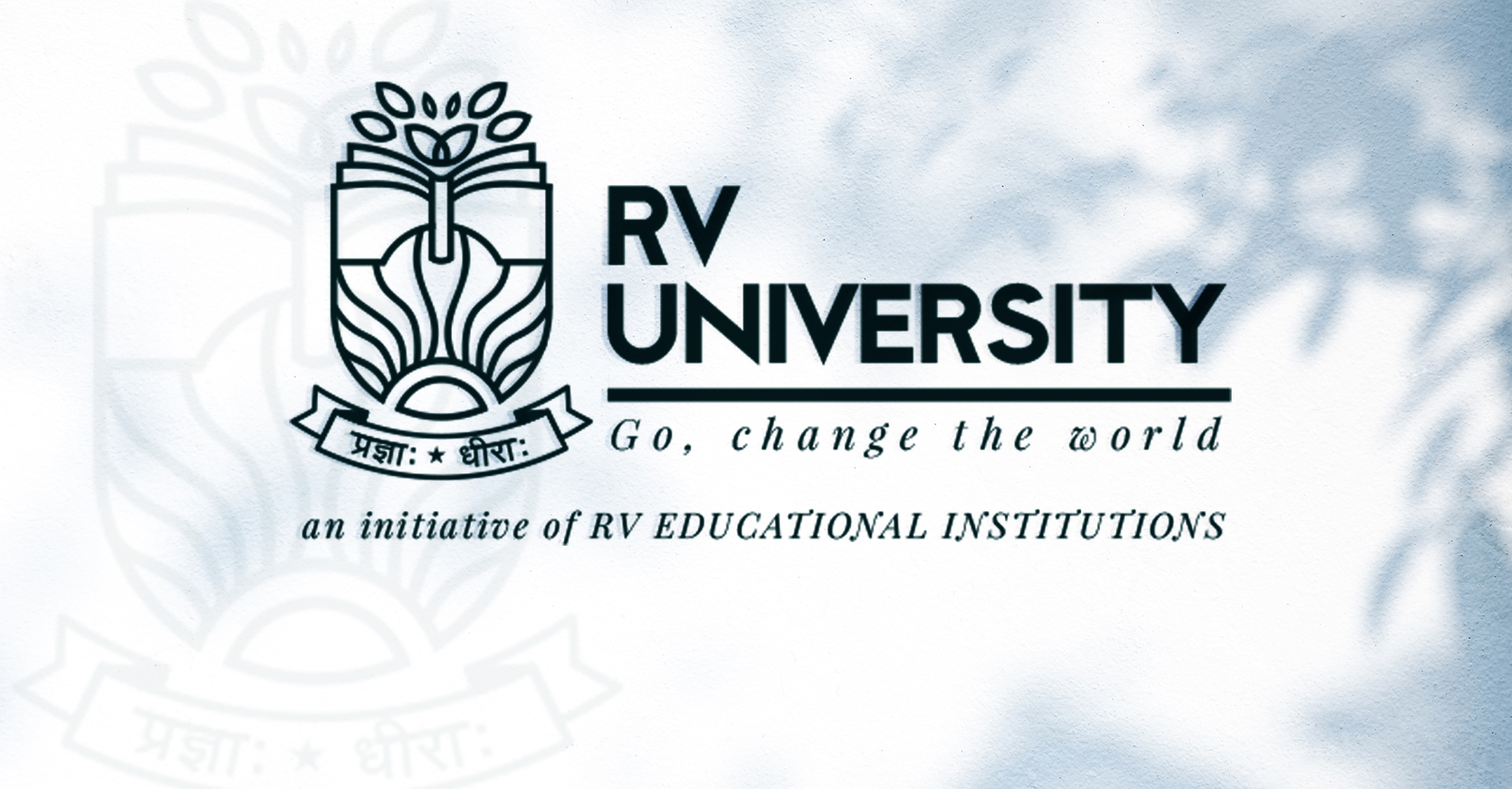
This reputed educational organization from Bangalore was in need of a brand identity that aptly captured their legacy, their strength and their value proposition. So we combined three elements to tell their story. A rising sun signifies a bright future or a new dawn for their students, a tree signifies growth, and a book to signify knowledge. The logo was given a traditional monogramesque look but in a modern style to bridge the past with the future.
Scope: Brand identity, Communication, Branding, Strategy, Logo Design
RV University is an established university in Bangalore. It provides a wide range educational course. They have educational programs that cater students from kindergarten to post graduate. They have 20+ educational institutes and more than 20,000 students are enrolled in them. They have education programmes in wide range of fields that also at an affordable price. They practice inclusivity and accept students from all sections of society. They stand as a reputed and respected University. They are present for more than 8 decades and needed to modernise their Logo.
INDUSTRY:
Education, Higher education, University
SCOPE:
Brand Identity, Communication, Branding, Strategy, Logo, Design

Challenges: The challenge was to modernise the existing logo that also represented the legacy RV University has created. We needed to give the university a new touch keeping in mind the strong establishment it already is.
Brand Identity:
With the help of experimentation and visualization we created a bunch of logo options. Each logo option followed a different thought process.
The thought process of brand design for RV University is based on three pillars,
1. It gives you a fresh start towards a bright future.
2. It is a place where our knowledge is strengthened by what we study and what we sowed is nurtured.
3. The nurtured seed then gives you endless sources of growth.
Taking inspiration from these three pillars of thought, we got some ideas…
We could represent our thoughts through graphical elements that symbolise these thoughts. We have used trees, the sun, and books.
The Sun: Represents a fresh beginning.
Trees: Trees represent growth and networking.
Books: They represent a lot of things like knowledge and learning.
Collaboration: Collaboration: We combined elements and experimented with our creativity. Our focus was representing the university as a positive, inclusive, and nurturing ecosystem. It was a great honour to be able to work on a project that gave us a chance to give modernised look to a well-known University. .