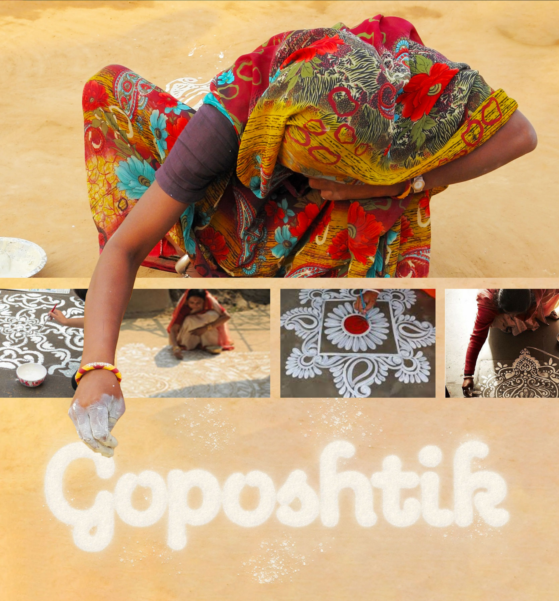
Goposthik
We have always worked with a simple principal –“Jo apne
bacchon ko khila sakte hain vohi customer ko khilayenge"
-founder of Gopala

A brand that has been a
leader in unadulterated dairy products for over 60 years—while briefing Team
Venacava on their new agro-food venture.
Gopala, as a brand,
carries a legacy rooted in purity and unadulteration. What started on humble
scale as a small dairy shop in Amar Colony in 1968 , grew into a trusted name
in North Delhi and eventually expanded across the city into 40+ outlets. Their success
was built on one thing—purity
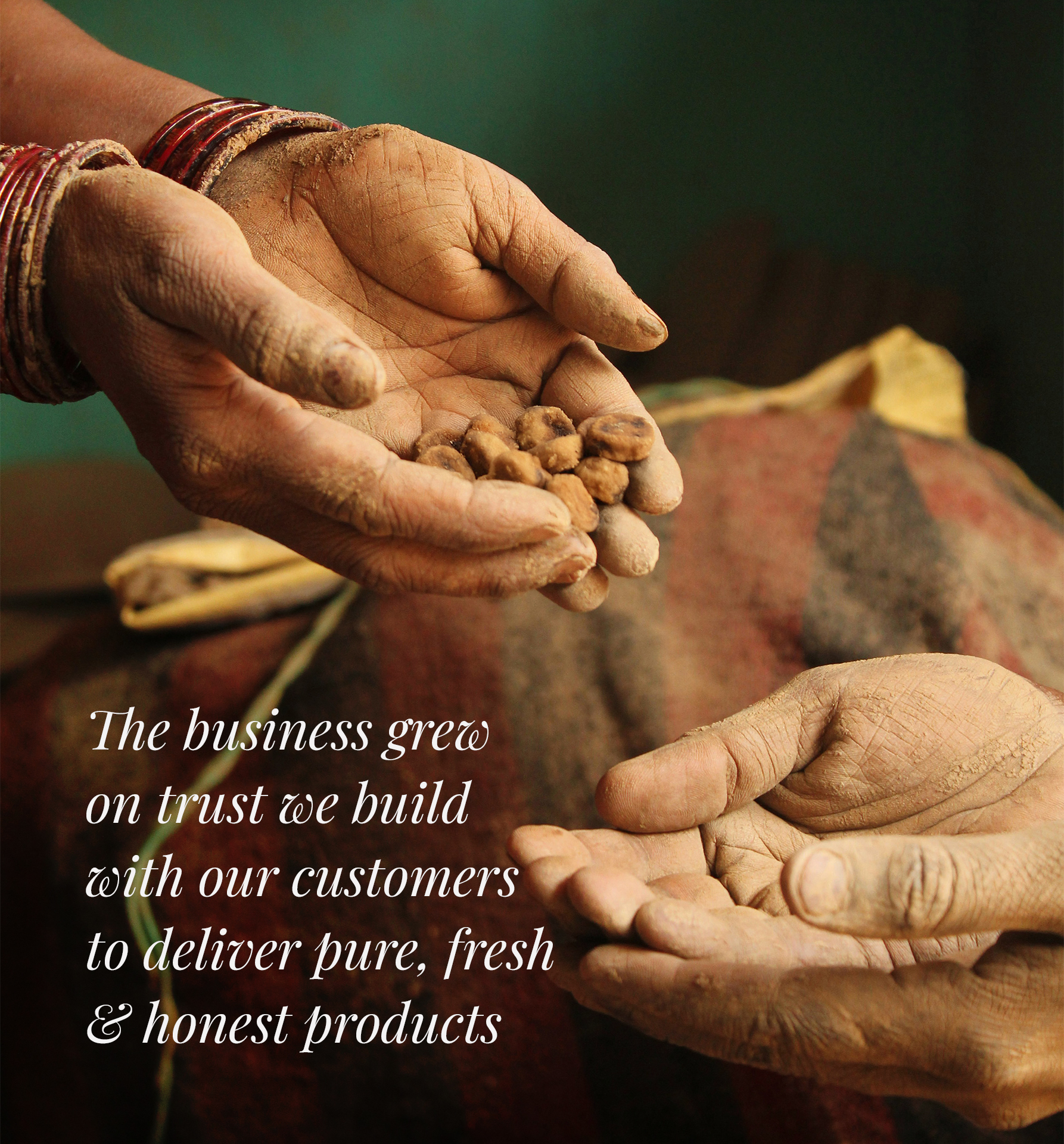
"The business grew
on trust we build with our customers to deliver pure, fresh & honest
products"
With the new venture,
they sought to craft a new brand that upholds these same values—a brand that
would become a symbol of trust and purity, representing our traditions in the
competitive and often ruthless agro-food industry.
This idea gave birth to
a new mission which is goposhtik
the name in itself tells
"Go" signifies
their larger purpose. A call to action.
"Poshtik"
represents nutritious, ideal food.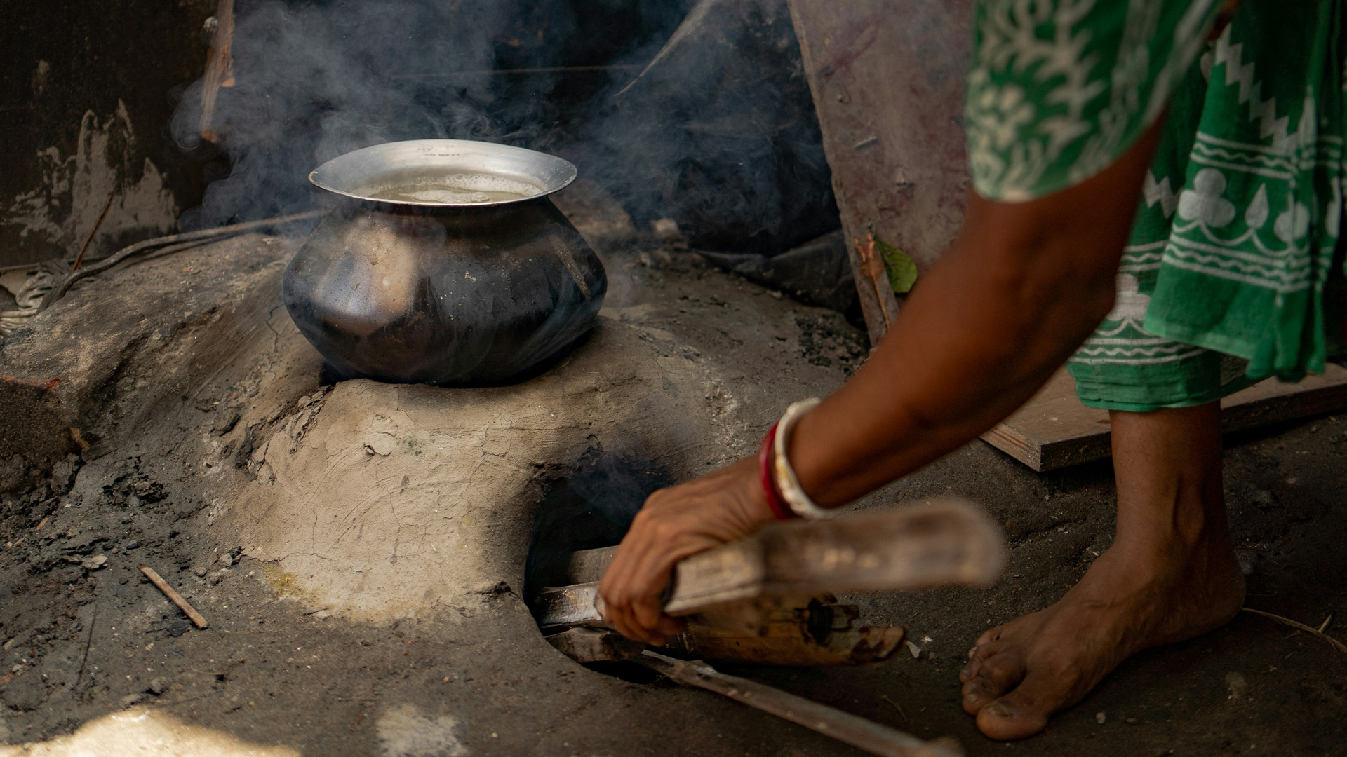
After discussions with
Kartik arora (founder),
we aligned with their
mission—preserving purity and securing a better future for the next generation.
As a design studio, our
challenge was to craft a story as pure as their products—an identity so
authentic and impactful that it left no gap between the brand’s message and its
consumers experience.
As we immersed ourselves in Gopala’s legacy, it became clear that Goposhtik was not just about offering better food choices—it was about safeguarding a way of life. The purity they stood for was not something new; it was a continuation of traditions passed down through generations.
As we know that a strong
brand idea should connect deeply with its audience by tapping into existing
values and cultural associations. For Goposhtik, this connection was built
around trust, heritage, and purity.
The realization was
simple: Goposhtik was not reviving a lost tradition— it was preserving what had always been integral
to our lives, it was what Arora's father passed on to him . This understanding
shaped the brand’s
core idea:
GOPOSHTIK – Traditionally
Yours.
This wasn’t just a
tagline. It was a slogan for their mission, now his mission
just like his father
started purity 1st dairy brand
he added same values to
his agro food brand.
A strong brand identity
should not only communicate its message but also evoke the right emotions. For
Goposhtik, the essence of nourishment, care, and purity had to be visualized in
a way that instantly resonated with its audience
We started by asking a
simple question:
Who is the epitome of
nourishment and trust?
The answer was clear—Maa
(mother).
This insight became the guiding force behind the brand’s visual elements. The mother figure is universally associated with care and purity, making it the perfect symbol for a brand dedicated to honest, unadulterated food. We crafted a monogram featuring a mother’s embrace, subtly interwoven with elements of natural grains, reinforcing the idea of nourishment and tradition.

To complement the
monogram, we developed handcrafted typography that echoed Goposhtik’s
commitment to handpicked ethically sourced ingredients. The letterforms carried
a sense of heritage, yet with a refined contemporary touch to ensure relevance
in today’s time
Brand design
should bridge the gap between business strategy complement the monogram, we
developed handcrafted typography that echoed Goposhtik’s commitment to
carefully chosen, handpicked ingredients.
By aligning the brand
identity with Goposhtik’s mission, we helped them communicate their purpose
effortlessly.
With this strong
foundation, Goposhtik entered the market with confidence. Their branding became
more than just visuals—it became a tool to reinforce their commitment to purity
and unadulterated nutrition. Goposhtik's brand identity became a standout for
something timeless- trust and tradition
GOPOSHTIK
traditionally yours


Comments